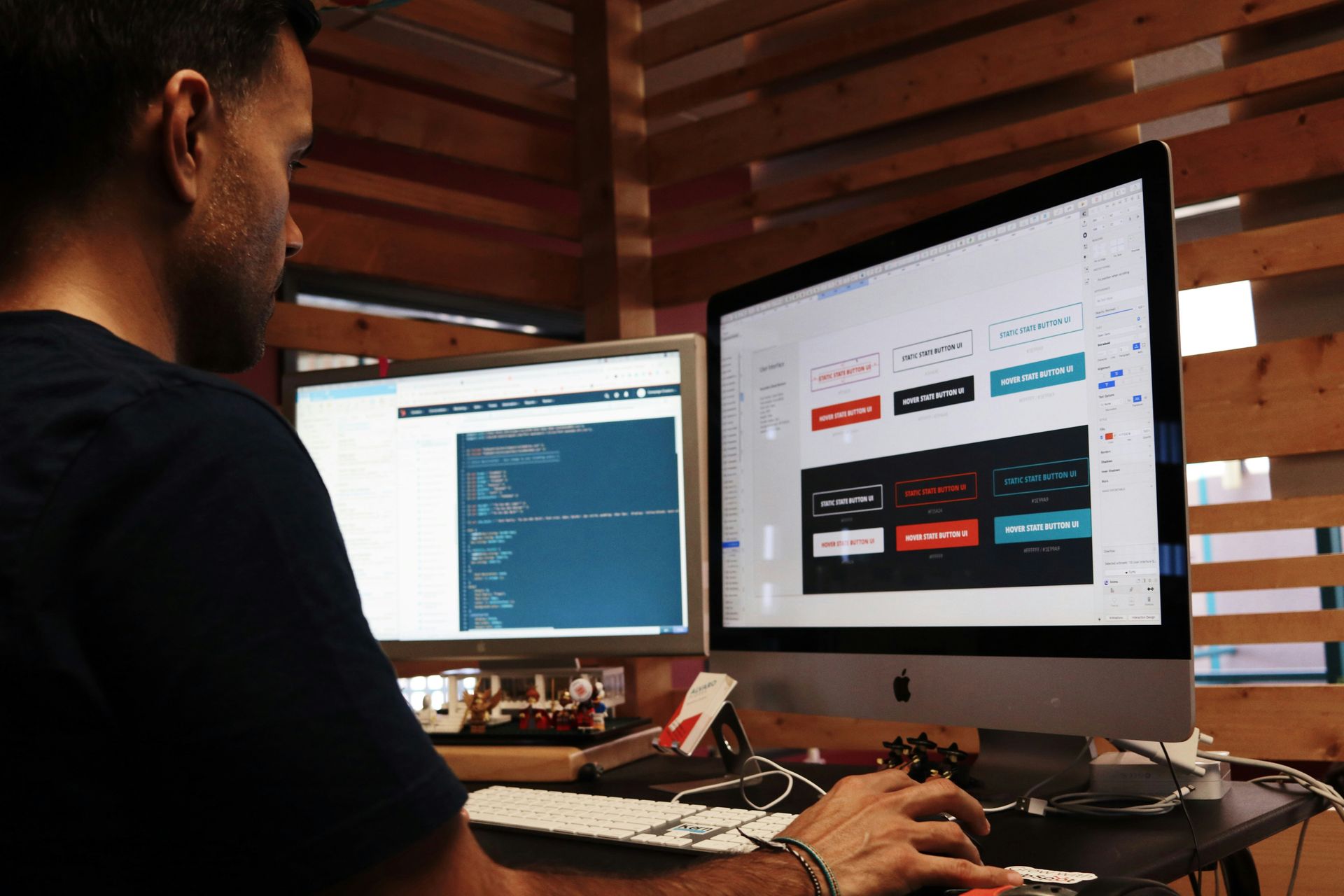
Landing Page Design San Diego: The Anatomy of a High-Converting Page
Have you ever wondered why your competition’s landing pages work and yours don’t?
No, it’s not because of the fancy CTA buttons and high-res media. Instead, something you may have overlooked about your landing page design in San Diego may be how it positions your brand.
In other words, your landing page may look pretty — but it hardly tells your picky San Diego customers how you’re better than that same business next door.
Don’t fret. Here’s a breakdown of what your landing page needs to keep customers clicking (and buying).
What’s a Landing Page For?
Slap yourself if you think that a landing page is to showcase your products and services. Your landing page is there
to do one thing — convert.
Without tailoring it to your likely customers, their problems, and their desired outcomes, you’re throwing web design cash into a paper shredder.
To make your landing
page pretty and profitable, make sure you design it based on:
- Who it’s for
- The changes the featured product or service creates
- Why your team is THE team to go to
Puzzled With the “Positioning” Part? Pay Attention
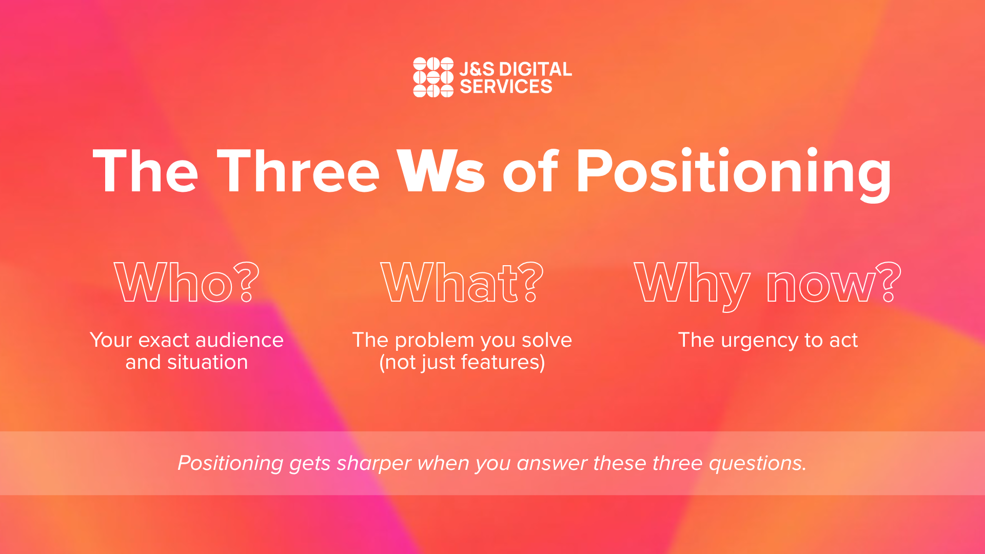
We’ve thrown around the word “positioning,” but what does it really mean for you? Without diving into too much marketing-speak, it’s simply your answer to what we call “The Three Ws.”
These are:
- Who?: Who’s your offering for? Get real specific, down to the industry, buyers’ journey stage, and constraint (what’s keeping them on the fence).
- What?: What does your product deliver? And no, don’t yap on about features. Talk about what problems you’re solving for the audience.
- Why now?: What will your reader miss out on? Answer this question to create a sense of urgency.
How To Structure Your Landing Page’s Messaging
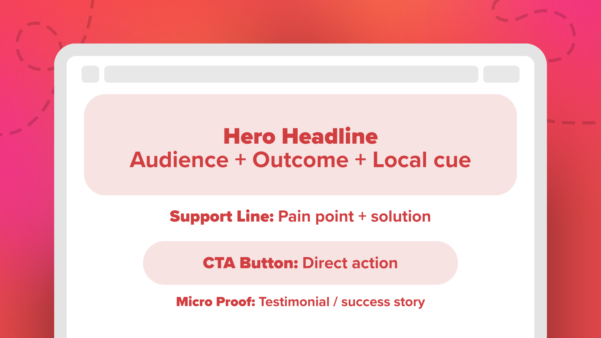
Once you’ve answered the Three Ws, you’ll have foundational content for your landing pages, as well as an idea of how to design them.
Here’s what you need to put on your landing pages using your insights from the previous step.
Hero Headline
This should “pop” and contain the desired outcome, your audience, and a local cue (San Diego). For example, “Fast, Easy, and Delivered-to-Door Meals for Busy San Diego Professionals” gets more attention than “Meal Prep Services in San Diego.”
Support Line
This can be just under the hero headline, where you concisely hammer down a pain point and solution. Think: “Skip Salad Prep Sundays and Get Your Weekly Meals Delivered.”
Primary CTA
Do you want your readers to “get a free sample meal” or “book a nutritional assessment?” Say so in visible button form!
Micro Proof
Some of your readers may end up on your landing page and still be on the fence. Nudge them closer to clicking on your CTA with testimonials from past clients (case studies and success stories work too).
Clarity > Clever Copy
Conversion is all about clarity. So, when you’re building your pages, design based on your audiences. For example, if you’re targeting busy professionals who’ll be on their phones, your
landing page design in San Diego needs to be mobile-friendly. By contrast, feel free to stick with a desktop-friendly build if you’re offering SaaS.
As for timelines, there’s some wiggle room and variation. When you’re dealing with a web designer in San Diego, you’ll often get timelines ranging from eight hours to even a couple of months, depending on revisions and collaboration.
Would you prefer to leave out pricing? You can, but be sure to have a CTA for a free consultation — or even better, talk about the scope of services you provide and average costs.
“Press the Bruise!” With “Pain Points”
Whether you choose to include three or five, your pain points need to be accompanied with five ways your offerings provide a solution. You can also have CTAs for each one.
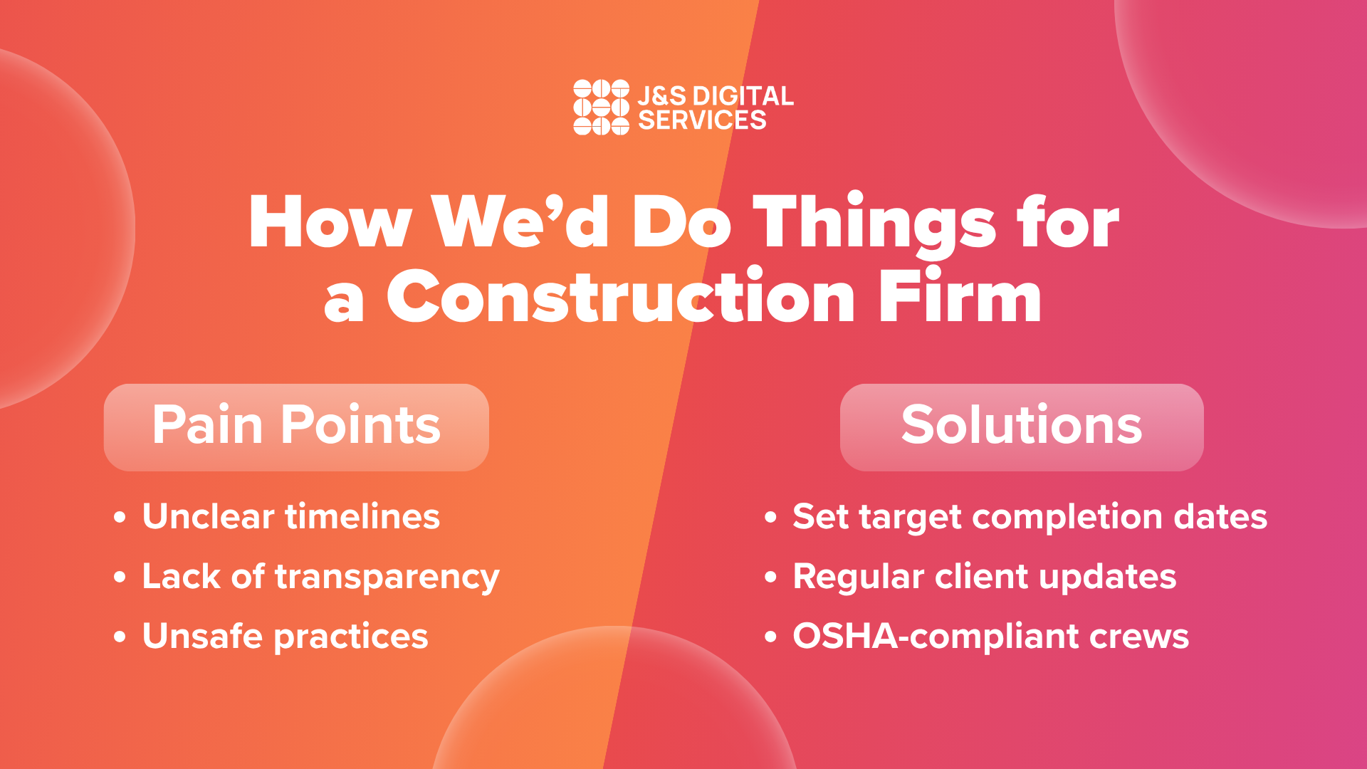
For example, construction is one of the
largest sectors in San Diego. If you’re a contractor or developer and designing a landing page for company, three pain points potential clients feel may be:
- Unclear timelines
- Lack of transparency
- Uncompliant jobsite practices
You step in with:
- Bespoke and agreed upon target completion dates
- Keeping clients in the loop each time with regular emails
- OSHA-compliant teams and practices
Put Proof in the Pudding With Proof Pillars
You’re good to go with this step if you already have a portfolio of satisfied clients. When you’re leveraging social proof from testimonials, include two to three lines of what your offering did for clients. This way, there’s no fluff, and readers can scan through problems you’ve actually solved.
If you’re short on clients, don’t sweat it. You can turn one case into a compelling before-and-after story that highlights the transformation your offering created.
And don’t be afraid to use logos of past clients for social proof — but only after you’ve asked permission.
Local Is Relevant
When it comes to landing page design in San Diego, there should also be a clear list of service areas. Adding this scores you points for local SEO and makes you easier to find and visit.
While you’re at it, you can also point out local realities and problems for that added “San Diego” touch. Doing this will make you a hit for most businesses, particularly those in:
- Professional services
- Home services
- B2B tech
- Healthcare
Micro-FAQs for Objection Handling
Some interactions with leads will reveal recurring questions. Address them for future clients in a mini-FAQ section at the bottom of your page.
There’s no set number for how many to include, but a good rule of thumb is four to six. Then, include snappy and concise answers for easy readability.
Three Steps to High-Converting Landing Page Design in San Diego
So, what do the tips we’ve given look like in practice? What you’ve just read may seem like a lot, but it’s actually just three steps:
- Discovery: Figure out who your audiences are, their pain points, industry, and where they are in the buyers’ journey.
- Strategy and Copy: Fill in your hero headline, support line, CTA, and proof with copy.
- Build + Launch Guidance: Design your pages for mobile or desktop-friendliness, leverage social proof, and launch.
Your CTA Strategy
Your primary CTA should be repeated in two to three places in your landing page. When it comes to how to state CTAs, be direct instead of relying on the done-to-death “learn more.”
Of course, some of your readers may still be unsure. For those who aren’t ready to pull the trigger, add a “softer sell” option like a contact form.
Key Takeaway: Clarity Converts
If there’s one lesson you should walk away with, it’s that positioning is being clear with what you’re offering and who it’s for. Design your landing page with this in mind, and you’ll be amazed at how much more conversions you’ll see.
But if you need a team who can do this for you, we’re here. Get a free consultation today and see how we do high-converting landing page design in San Diego.
FAQs
How long does it take to design a landing page?
It depends. A simple page can be built in a day, while a more custom design with revisions may take a few weeks.
Do I need to list prices on my landing page?
Not all the time, but always include a free consultation or outline average project costs to build trust.
What’s the most important part of a landing page?
Clarity.
By that, we mean:
- A clear headline
- Direct call-to-action
- Proof your offer works
These will always beat clever copy or flashy design.