
How To Make Your Logo Stand Out: 8 Tricks and Tips
Having a proper logo for your business says everything to your customers without having to ever meet them or speak with them. Logos should elicit a feeling of trust, integrity, and excellence. They should evoke a sense of connection and common ground between both a brand and its customer base.
Logos act as an exclamation of the type of service or product you offer, and if done correctly, give your customers the impression that they’ll be in great hands working with or buying from you. It’s not all about how the logo looks, but rather about how and why it attracts attention and mindshare from potential and repeat customers. Basically, it’s really important to have a great company logo.
Our team here at , J & S Digital offers logo creation or rebranding services to our clients and we’ve seen firsthand how big of an impact great logos can make. So, here are 8 of the most common tips and tricks we use/recommend to make your logo stand out from the crowd:
1. Your Logo Needs to Be Original
According to Oberlo, an e-commerce platform, over 4 million new businesseswere started in 2020 just in the U.S. alone, so the need to distinguish your company from the rest of the pack is a must. There are a handful of automatic logo generating sites out there which are a great source for inspiration and can get you started on figuring out what look and feel you’re going for. However, we don’t recommend finalizing a logo design off of a template you find online.
Odds are, tons of other companies have used those same automated services to create a design and likely have a logo that’s similar, or maybe even identical, to yours. Make sure that your logo has original elements included in it (even if you base it off of an existing design) such as unique fonts, texts, shapes, colors, etc. to have the greatest impact. If a customer has to question whether they’ve seen your logo before, you’re on the wrong track.
2. Your Logo Needs to Be Meaningful and Memorable
You want to have a company logo that is identifiable and meaningful, it shouldn’t just blend in. Ideally, your customers could see your logo from many miles away on a billboard and be 100% familiar with what you stand for and represent. With no meaning behind your logo, it’s very easy to forget about your brand and move on to the next best thing. By addressing your customers’ curiosities and interests in your logo design, you can capture their attention and trust.
3. Your Logo Should Be Simple
Most long-standing brands in the world, such as Coca-Cola, Microsoft, Starbucks, etc. have updated and relaunched their logo designs over the years to keep up with trends and consumer preferences. One of the primary focuses for most brands in the last few years has been to simplify and minimize the design concepts they use. For example, Burger King just recently rebranded and launched an updated logo for the first time since 1999. They reverted back to a simpler, less colorful logo with a straightforward design with the goal of giving the brand a sleeker, higher-end look.
4. Your Logo Should Be in Line With Your Brand Vision
If your goal is to sell products or services to high-end clients for large price tags, going with a bold, colorful-looking logo (such as one for a fast-food company meant to attract people driving by on the highway) will likely not serve your business very well. Instead, you’d want a sophisticated and modern design that leaves the impression that you’re a top-notch and classy organization. Perceived Value is a critical component to branding your business, so keep it in mind when making decisions related to design and direction.
Your logo will be used across all of your products, packaging, online presence, marketing materials, emails, and so forth. Make sure that it makes sense for all of those individual scenarios to create a cohesive and unified brand experience.
5. Pick Colors That Make Sense For Your Business
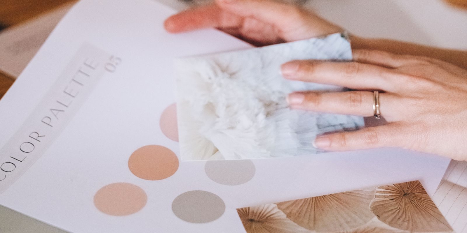
Selecting a color scheme for your logo is a big decision that can have a long-lasting impact on how new and existing customers perceive your brand. While you could technically pick just about any color for any type of company logo, instead you should take consumer behavior into consideration. Security brands tend to go for more blues/
Research items such as color theory and/or consumer color psychology and you’ll see that color scheme choices can make a big difference - positive or negative - depending on which direction you go in.
6. Your Logo Should Be Recognizable With or Without Text
If your business sells products or services globally, having a logo that can be recognized and understood without explanation or text is very valuable to a brand. Take examples such as Apple or Twitter, whose simple and text-free logos are recognizable on a global scale regardless of language or culture barriers. It’s far easier to build brand identity and loyalty if all potential customers in the world can get a clear sense of what your company represents and offers. Make your logo memorable like the ones highlighted here in Inc’s top 10 logos ever made article.
7. Use White Space to Your Advantage
Even if you chose to go with a colorful, eye-popping design for your brand, you should still ensure that your logo makes the most out of available white and negative space. You want customers to see your brand as organized, so avoid keeping your design too busy. Clean logos that follow this tip are great for multipurpose use on items such as company merchandise or brochure designs.
8. Your Logo Should Be Versatile and Usable Everywhere
Logos are utilized across all online and print mediums, so make sure that your design, color scheme, and text are versatile and can be used in all situations. Brands need to provide customers with a cohesive experience, not a disjointed one where for example your website logo and print logos are completely different. While logos can be slightly altered or adjusted to fit the specific need at any given time, there needs to be an element of consistency across all platforms.
It's Okay to Let Go of Your Logo
Redesigning your logo, or creating a new one from the ground up, might just be one of the best investments you can make in your brand's short and long-term growth. Don't be afraid to see what branding options are out there, you might just find the perfect way to bring your vision to life.
Hopefully, these tips and tricks were helpful as you consider redesigning your current company’s logo. If you need additional help with your logo or rebranding, give us a shout! Here at J&S Digital Services, we always put honesty, transparency, and our clients first.
So, reach out to us to see if we can help you with your business’ logo redesign! Let's get started on your next graphic design project and begin your brand's journey to online domination.